In the other tabs, the historic behavior of the values has been pursued but I would now like to switch and focus on the projected future values which were included in the data. While the information is now mostly predictions of past values, there is still insight to gain from seeing where predictions were leading the historic data.
Climate Scenarios
The future data, some of it now in the past, is divided into forty scenarios between two RCPs, or representative concentration pathways. These pathways represent climate change scenarios with a larger number indicating less done to prevent it. We have two of these RCPs, 4.5 which is a moderate path with an emissions peak at or before 2040 and a 8.5 which would imply that emissions continue to rise and peak after that value or never. The scenarios are sub models of the RCP which represent a possible way that the variable will behave going forward. Lets see what the scenarios do with the seasonal volumetric water content graph we’ve been using.
Scenario Spaghetti (VWC)
Code
## Importing librarieslibrary(tidyverse)library(RColorBrewer)## Color palette for scenariosmycolors <-colorRampPalette(brewer.pal(11, "RdBu"))(40)mycolors <-rev(mycolors)## reading in necesary data, it took to long to processvwc_chunk <-read.csv("../Data/vwc_data_nearterm_scenario.csv")## Plotting with interactivityplot <-ggplot(data = vwc_chunk, aes(x = Year, y = value, color = Scenario)) +geom_smooth(se =FALSE) +labs(title ="Volumetric Water Content by Season and Scenario") +ylab("Median Cubic Meters of Water per Cubic Meter of Soil") +labs(caption ="Data from the US Geological Survey") + my_theme +scale_color_manual(values = mycolors)ggplotly(plot)
Caption: This graph shows different scenario expectations for seasonal volumetric water content. Specific scenarios can be chose with the slider on the right.
Now, this looks like a mess, with so many scenarios it becomes hard to pick out any specific process although in this case each scenario can be clicked and engaged with. However, in each case the scenario number represents when global emissions would peak and how that would effect the variables. While interesting on a micro level, its hard to compare each and every scenario to each other and thus the overall differences are hard to note outside of color. In order to alleviate this problem in this section we will be looking at the groups of scenarios or the RCPs.
Scenarios by Representative Concentration Pathways
Code
## Importing overall datatotal_cleaned <-read.csv("../Data/total_merged.csv") %>%select(-X)rownames(total_cleaned) <-NULL## Refining the information i'm interested innearterm_cleaned <- total_cleaned %>%filter(RCP !="historical")RCP_Scenario <- nearterm_cleaned %>%select(c(RCP,scenario)) %>%unique()## Plotting with interactivityplot <-ggplot(RCP_Scenario, aes(x = RCP, fill = scenario)) +geom_bar() +labs(title ="Scenarios in Each RCP") +ylab("Amount of Scenarios") +labs(caption ="Data from the US Geological Survey") + my_theme +scale_fill_manual(values = mycolors)ggplotly(plot)
Caption: This chart shows the groupings of the scenarios in the RCP groups and can give content to the previous graph.
As mentioned before, the scenarios that indicate a peak before 2040 or so are grouped up in the 4.5 RCP while the rest are with RCP 8.5. This is not the limit of the usefulness of the representative climate pathways but it is what we will be using in our analysis. Now lets reappraise the VWC graph with RCP values instead of scenarios.
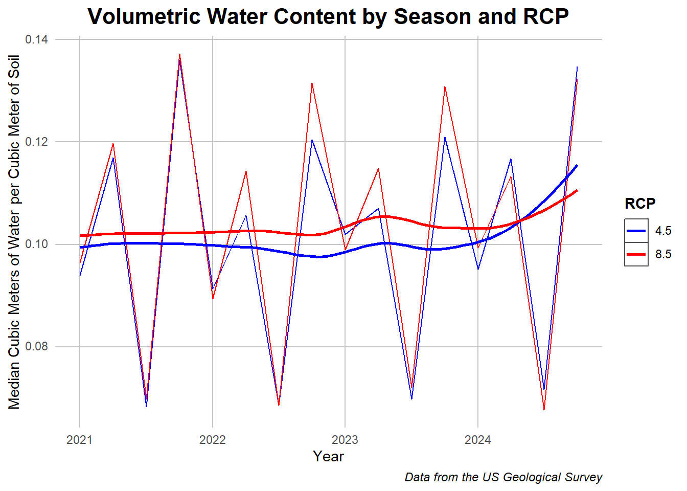
RCP Differences (VWC)
Code
## Reusing dataset and summarizing differentlyvwc_chunk2 <- vwc_chunkvwc_chunk2 <- vwc_chunk2 %>%group_by(RCP,Year) %>%summarise_at(vars("value"), mean)vwc_chunk2$RCP <- vwc_chunk2$RCP %>%as.character()## Plottingggplot(data = vwc_chunk2, aes(x = Year, y = value, color = RCP)) +geom_line() +geom_smooth(se =FALSE) +labs(title ="Volumetric Water Content by Season and RCP") +ylab("Median Cubic Meters of Water per Cubic Meter of Soil") +labs(caption ="Data from the US Geological Survey") + my_theme +scale_color_manual(values =c("blue","red"))
Caption: This plot has the smoothed and seasonal volumetric water content
In this instance, their is not a large difference between the two RCP results on the water content, as we’ve established before differences in that value come more from location, but RCP 8.5 could be seen to be a bit more extreme on both angles. As a reminder this is only the estimation of what these values would be from 2018 and are not historic results. Given this RCP framework, lets consider some of the other variables and how they interact with RCP.
RCP’s Effect on other Variables
Comparing Seasonal Precipitation
Code
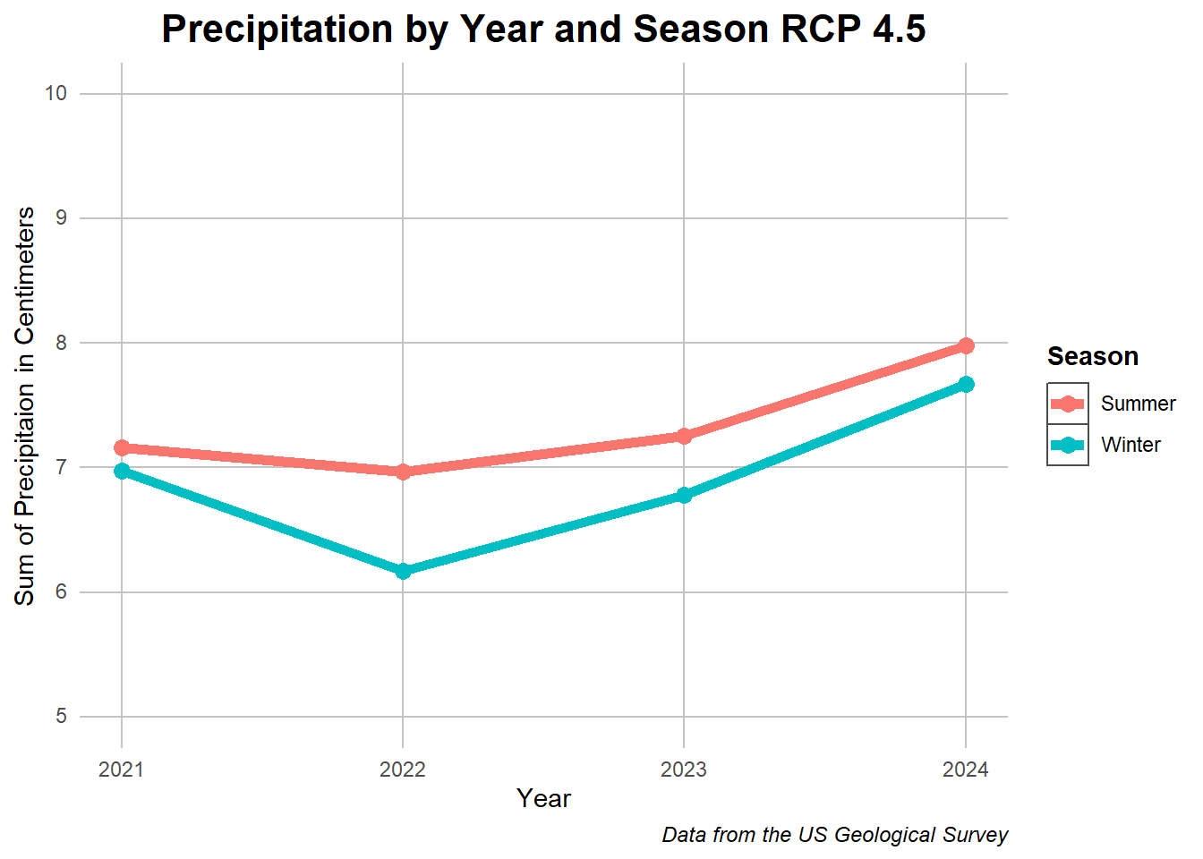
## Data cleaningppt_chunk <- total_cleaned %>%filter(RCP =="4.5")ppt_chunk <- ppt_chunk[,c(3,18:19)] %>%na.omit()colnames(ppt_chunk) <-c("year", "Winter", "Summer")## Aggregation and pivotingppt_chunk <- ppt_chunk %>%group_by(year) %>%summarise_at(vars("Winter","Summer"), mean) ppt_chunk <- ppt_chunk %>%pivot_longer(cols =c("Winter","Summer"))## Plottingggplot(data = ppt_chunk, aes(x = year, y = value, color = name)) +geom_line(size =2) +geom_point(size =3) + my_theme +xlab("Year") +ylab("Sum of Precipitaion in Centimeters") +labs(title ="Precipitation by Year and Season RCP 4.5") +guides(color=guide_legend(title="Season")) +labs(caption ="Data from the US Geological Survey") +ylim(5,10)
Code
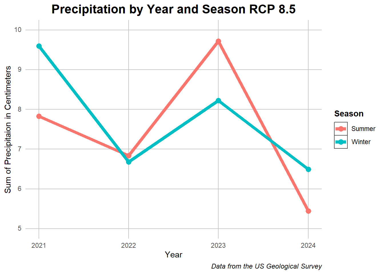
## Smae process of data cleaning with on differenceppt_chunk <- total_cleaned %>%filter(RCP =="8.5")ppt_chunk <- ppt_chunk[,c(3,18:19)] %>%na.omit()colnames(ppt_chunk) <-c("year", "Winter", "Summer")## Summary and pivotppt_chunk <- ppt_chunk %>%group_by(year) %>%summarise_at(vars("Winter","Summer"), mean) ppt_chunk <- ppt_chunk %>%pivot_longer(cols =c("Winter","Summer"))## Plottingggplot(data = ppt_chunk, aes(x = year, y = value, color = name)) +geom_line(size =2) +geom_point(size =3) + my_theme +xlab("Year") +ylab("Sum of Precipitaion in Centimeters") +labs(title ="Precipitation by Year and Season RCP 8.5") +guides(color=guide_legend(title="Season")) +labs(caption ="Data from the US Geological Survey") +ylim(5,10)
Caption: A comparison between the charted precipitation of RCP 4.5 and 8.5 in various years and conditions
Between these two graphs, RCP 8.5 can be seen to have more wild differences in precipitation from year to year while RCP 4.5 has a smoother but increasing trajectory. The seasonal expectations still align but there are differences between the two on whether there will be an increase or decrease in precipitation. For what its worth, consistency of weather often has more of an effect than its intensity so this may be a sign that the 4.5 RCP will hold on stronger than the other. Now lets look at the same set of graphs analyze in the exploratory data analysis tab.
## Establishing variableother_vars <- total_cleaned %>%filter(RCP !="historical")## Evap_summer summaryother_graph1 <- other_vars %>%select(c(RCP,year, Evap_Summer))other_graph1 <- other_graph1 %>%group_by(RCP,year) %>%summarise_at(vars("Evap_Summer"), mean) ## Plottingggplot(other_graph1, aes(y = Evap_Summer,x = year, color = RCP)) +geom_smooth(se =FALSE) + my_theme +labs(caption ="Data from the US Geological Survey") +labs(title ="Evaporation in the Summer by Year") +xlab("Year") +ylab("Centimeters of Evaporation") +scale_color_manual(values =c("blue","red"))
Code
## Dry Soil Days summaryother_graph2 <- other_vars %>%select(c(RCP, year,DrySoilDays_Summer_whole))other_graph2 <- other_graph2 %>%group_by(RCP, year) %>%summarise_at(vars("DrySoilDays_Summer_whole"), mean) ## Plottingggplot(other_graph2, aes(y = DrySoilDays_Summer_whole,x = year, color = RCP)) +geom_smooth(se =FALSE) + my_theme +labs(caption ="Data from the US Geological Survey") +labs(title ="Days with Dry soil in the Summer by Year and RCP") +xlab("Year") +ylab("Days") +scale_color_manual(values =c("blue","red"))
Code
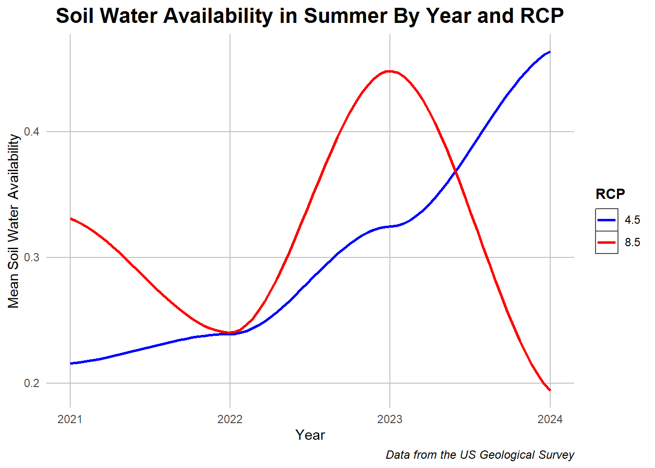
## Non Dry SWA Summaryother_graph4 <- other_vars %>%select(c(RCP, year, NonDrySWA_Summer_whole)) %>%na.omit()other_graph4 <- other_graph4 %>%group_by(RCP, year) %>%summarise_at(vars("NonDrySWA_Summer_whole"), mean)## Plottingggplot(other_graph4, aes(y = NonDrySWA_Summer_whole,x = year, color = RCP)) +geom_smooth(se =FALSE) + my_theme +labs(caption ="Data from the US Geological Survey")+labs(title ="Soil Water Availability in Summer By Year and RCP") +ylab("Mean Soil Water Availability") +xlab("Year") +scale_color_manual(values =c("blue","red"))
Code
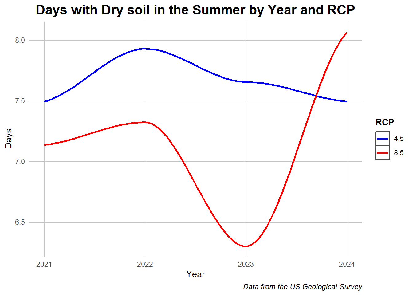
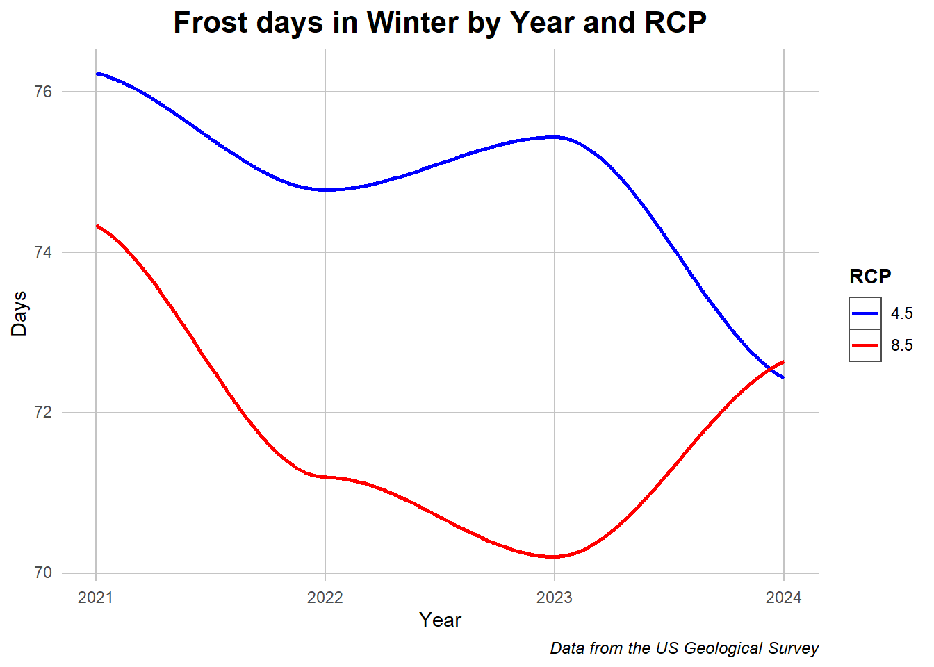
## Frost days Summaryother_graph3 <- other_vars %>%select(c(RCP, year,FrostDays_Winter))other_graph3 <- other_graph3 %>%group_by(RCP,year) %>%summarise_at(vars("FrostDays_Winter"), mean) ## Plottingggplot(other_graph3, aes(y = FrostDays_Winter,x = year, color = RCP)) +geom_smooth(,se =FALSE) + my_theme +labs(caption ="Data from the US Geological Survey") +labs(title ="Frost days in Winter by Year and RCP") +xlab("Year") +ylab("Days") +scale_color_manual(values =c("blue","red"))
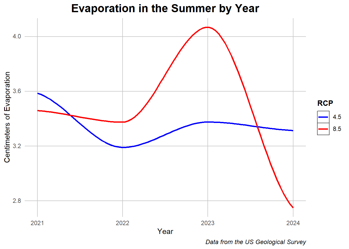
Caption: A set of variables changes over time split by RCP value.
To begin, the 8.5 scenario expects a lot of evaporation around 2023 which implies a wet year before falling off. Separately, the days with dry soil diverge to start but end with a reversal of the trends, this extreme dip from the 8.5 RCP must here reflect expectations from some of the more extreme scenarios. Once again 4.5 shows more consistency which may be better even if it means more dry days. Soil water availability is almost the opposite of the previous graph, showing a similar relationship with extreme precipitation in 2023 before a dry spell, the extremity of it reflecting the climate variability. Frost days meanwhile show more convergent behavior but indicating that the number of days below -1 Celsius would decrease either way. The increase at the end of the 8.5 value must indicate an expected cold spell which may relate with the results of other data.
To summarize these graphs, the 8.5 model predicted a wet period in 2023 before drying out while the 4.5 values stayed more consistent with slight positive and negative trends.
Conclusions
The prediction scenarios and RCP categories show how climate can be as much about extremes as it is consistent differences. Meteorology is inherently chaotic, it originates the butterfly effect term, but we can also hope for more beneficial outcomes which will space us the future of improper weather patterns foreseen by some of the models. The Natural Bridges State Park and the data sourced by the United States Geological survey acted as a fantastic window for us to view the trends leading to the modern tipping point, leaving the question of which of the scenarios, the more optimistic or less, will end up being the truth in the coming years.